Hey everyone and welcome back to my blog! I'm Genni, and today I have a bit of a light-hearted post for you to read. As you peruse these covers I've mentioned today, you can click the cover and it will direct you to that novel's goodreads page!
As I pursue goodreads and see upcoming releases, I've noticed quite the trend with covers. Today I'll be looking at four different trends I've noticed.
The first trend I noticed was that there are so many yellow covers! Now you might be thinking, there's surely not that many yellow covers. But here's three just off the top of my head.
Here are three examples:
 |
| Meet Cute by Helena Hunting |
 |
| The Bride Test by Helen Hoang |
 |
| The Unhoneymooners by Christina Lauren |
And here are two others that I found literally two seconds ago on goodreads, when I went to my current read's page and updated my progress.
 |
| The Marriage Clock by Zara Raheem |
 |
| The Arrangement by Sonya Lalli |
And what do these books have in common? Well, they are all spring or summer releases that are marketed as contemporary romances. I'm not too sure that yellow screams romance - I'll leave that to red, pinks, and purples - but it sure does scream fun and fresh. The bright yellow consistently draws my eyes, and that's undoubtedly what these covers are trying to do, get readers' attention.
This makes me wonder, how do trends like this start? Is yellow a new trend, or have I just started to notice? For now, I'm just going to chalk it up to this - cover artists and design teams all suddenly have one brain, and they realized that yellow was going to be the color of the spring. Jokes aside, the probably came to the same conclusion I did - that our eyes are attracted to bright colors. Yellow sure does fit that bill. Plus, the shade, which is normally a mix between a true yellow and a mustard, isn't grating to the eyes.
Personally, I'm not complaining.
This yellow cover trend isn't alone, there's a slew of other trends happening right now as well.
For instance, there's a ton of YA (and non-YA) fantasy covers with snakes on them. Snakes are having a moment, y'all. Unlike the yellow covers, I'm not a huge fan of this trend, but to each their own.
Here's some covers of upcoming releases with snakes on their covers, which I found in less than 15 minutes of searching.
 |
| Queen of the Conquered by Kacen Callender |
 |
| The Queen of Nothing by Holly Black |
 |
| Serpent and Dove by Shelby Mahurin |
 |
| Ninth House by Leigh Bardugo |
Am I the only one who doesn't like this snake trend?
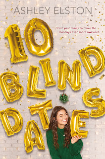
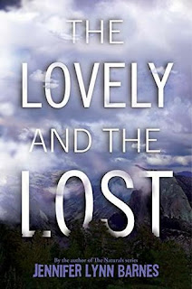
There's also a trend of having the title of a novel serve as the core of the cover. This title serves as the design of the book cover, with smaller background imagery and graphics supporting the main event.
Here's a handful of upcoming releases that follow this trend.
 |
| Waiting for Tom Hanks by Kerry Winfrey |
 |
| 10 Blind Dates by Ashely Elston |
 |
| Dangerous Alliance by Jennieke Cohen |
 |
| The Lovely and the Lost by Jennifer Lynn Barnes |
As you can see and/or deduce from these covers, this trend has surpassed genre lines. There's the adult romance of Waiting for Tom Hanks, the contemporary YA of 10 Blind Dates, the mystery of The Lovely and the Lost, and the historical fiction of Dangerous Alliance. While this trend is popular, I can find it easily boring. I did like it when I first picked up on the trend a year or so back, but the covers are all starting to blend together. Out of these covers, the only one that really works for me is Waiting for Tom Hanks, since there are at least three different fonts and the typography clues me in on both the setting and genre. Unfortunately, the others aren't nearly as effective for me.
What about you? Does this trend work for you?
And possibly the trend that I always see every day is in the women's fiction/romance genre. I'm not too sure how to explain it, but they all have the same feel. Here are some for your perusal:
 |
| Fix Her Up by Tessa Bailey |
 |
| The Right Swipe by Alisha Rai |
 |
| Fumbled by Alexa Martin |
 |
| Well Met by Jen DeLuca |
Am I the only one who gets the same vibe from all these covers? I feel like The Bride Test, Meet Cute, and Waiting for Tom Hanks play into this trend as well. The reason I'm tying these all together is the illustration style. They seem to all be digital drawings, most of which are of one or two of the protagonists. The covers also all have clean lines, making the covers give off a polished look. These covers also have several colors, with at least two repeated to tie the design in and make it look cohesive. There's the yellow ladder and yellow author name in Fix Her Up, the yellow typography and yellow shirt in The Right Swipe, the gold accessories of Fumbled, and the repeated blues and pinks of Well Met. And yes, it did not escape my attention that Fumbled, Fix Her Up, and The Right Swipe all incorporated some yellow tone into their covers. The trends are everywhere!
In the interest of not making this post annoyingly long, I'm going to stop here. However, there are so many other cover trends happening right now. If you start to look, I'm sure you'll pick up on several others that I didn't mention today. Some of these trends work better for me than others, but the all must be working in some capacity if they've become noticeable trends.
What cover trends have you seen recently? Are there some that are getting old and overused? What are some of your favorites and least favorites?
Thanks so much for stopping by and I'll see you soon with another post!
Happy Reading!
Genni @ Ready, Set, Read!


No comments:
Post a Comment